mandy
Member
 [Mo0:3]
Posts: 52
|
Post by mandy on Oct 3, 2011 18:50:57 GMT
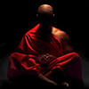
This is my first photo post, so be gentle with me.  You've probably already seen Rob's shots of this place, so this is my take on what we saw. The viaduct at that time in the evening brought about some really surreal light and shadows. This is the one Rob linked to. He's always getting in the way of my shots. ;D  The long shadows fascinated me. This one I thought looked like something out of a nightmare.   This one makes me feel sad, don't know why.  |
|
|
|
Post by jiro on Oct 3, 2011 19:37:51 GMT
Wow. I like it all. It sure does bring some fresh new look and perspective on common things. Your different take on the same subject with Rob is very unique in a forum. It's like having a nice conversation with two photographers and sharing their ideas to us so we can learn why they shoot it that way. Maybe, if you would be so kind, I would really love to know more about the story behind the shot as to what prompted you to take it. On the photography side, my suggestion for #1 would be to cropped away the sun on top by about 1/4 inch. For me, the strength of this shot lies on your inclusion of the other photographer in the frame. That nice rim lighting in his hairs is really what made it all quite nice. #2 is also very nice. I wonder if you would consider converting this to b&w? I love #3. I can imagine different ways to interpret this shot. For me, I would crop it more from the bottom to make the horizon positioned at the top 1/3 rule. For #4, I would add some soft focus effect on the image as the sharp textures does not seem to really add that much to the scene. Great images, Mandy. I'm really glad you joined us. I learned a lot from these images you showed to us. Hope to see a lot more.  |
|
|
|
Post by manthos on Oct 3, 2011 20:32:54 GMT
Nice images Mandy!
#3 is very interesting. I really like it. I agree with Jiro about the crop. You wouldn't lose much.
I also agree with Jiro about #4. And the black vignette is nice in this.
|
|
|
|
Post by chrisc on Oct 3, 2011 20:57:21 GMT
Ticky stuff...but you might want to check your camera for sensor dust as I do see one spot on the last one up near the top right. I would suggest that if you are going to use a vignette effect, that the tonal range of the overall piece be very good and even. I the last one, the man's shirt is just a bit overblown which essentially pushed my eye to the other object on the viaduct, a white box of sorts. Depending on your post processing tools, you could either add a layer mask and increase the value range in the box and shirt, or just in the shirt and clone out the box altogether. I played a little...and did so a bit of a crop but didn't redo the vignette to scale.  |
|
mandy
Member
[Mo0:3]
Posts: 52
|
Post by mandy on Oct 3, 2011 21:06:21 GMT
Thanks for your views Jiro & Manthos. It's interesting to get other points of view. I've made a b&w version of #2. I think it looks more spooky now, if maybe a bit busy.  Also I've tried a crop on #3.  For me the shot has now lost the dramatic effect that the original had. It was the shadows from the figures and the loose stones on the floor that attracted me to shot in the first place. I'll have another go at #4 later. |
|
mandy
Member
[Mo0:3]
Posts: 52
|
Post by mandy on Oct 3, 2011 21:11:42 GMT
Thanks chrisc, #4 does look 'cleaner' without the 'white box'. More playing needed. |
|
|
|
Post by jiro on Oct 3, 2011 21:11:52 GMT
That was a quick edit, Mandy.  I like the b&w conversion. it does made the shot more spooky. As for the other shot, that was just a personal preference on mine. I was more on proportions but you are right, it does changed the effect when the elongated shadows were cut off. I learned another lesson today. Thanks, Mandy. |
|
|
|
Post by manthos on Oct 4, 2011 10:32:52 GMT
Mandy, you're right about #3. Although, I had a less aggressive crop in my mind. And the B&W conversion of #2 works better for me. Maybe because I'm a fan of bw. I feel that shadows give the most of them when they are in monochrome.
|
|
mandy
Member
[Mo0:3]
Posts: 52
|
Post by mandy on Oct 4, 2011 15:35:49 GMT
O.k here is another version of #4, without the box and with a bit of blurring.  ........and another go at the b&w version of #2. I've blurred it a bit and added a large, dark vignette,as I thought the other was too busy.  |
|
|
|
Post by chrisc on Oct 4, 2011 21:42:27 GMT
The blur does give it a more "vintage" look, but I think it could be cut back a bit as it seems to overpower the more narrow, right side of the frame - where the eye is being directed.
The second one is so much better as a B&W and the rework is quite nice. Good job!
|
|