|
|
Post by jiro on Sept 25, 2011 11:48:06 GMT
|
|
|
|
Post by The Wirefox on Sept 25, 2011 12:22:41 GMT
Jiro
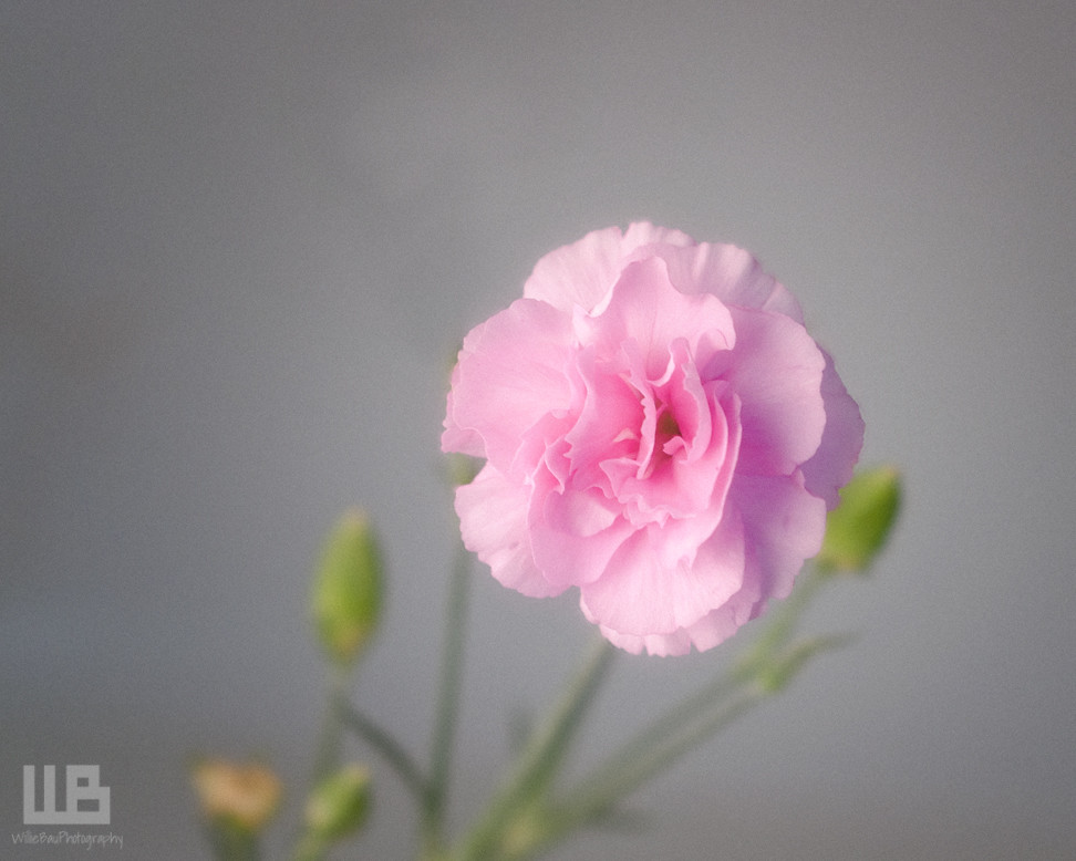
It works fine. You have managed to get a really nice soft feel to this image. I am seeing a little noise on the background but it is not too distracting.The green bud to the right of the flower is also distracting However apart from tearing apart your daughters flowers I think it could be taken out successfully by cloning.
I like the logo Jiro. It is not to intrusive but you may have to wind down the opacity of the WB on some images. You will always get some criticism for adding watermarks to the image but personally I don't mind if they are discreet like this.
PS: its does look better in the Flickr lightbox. I did toy with the idea of dark backgrounds for the forum but it can make everything look a little foreboding. the jury is out on that one. I may try to develop a dark discussion board skin when I have some time.
|
|
|
|
Post by jiro on Sept 25, 2011 12:30:45 GMT
Jiro It works fine. You have managed to get a really nice soft feel to this image. I am seeing a little noise on the background but it is not too distracting.The green bud to the right of the flower is also distracting However apart from tearing apart your daughters flowers I think it could be taken out successfully by cloning. I like the logo Jiro. It is not to intrusive but you may have to wind down the opacity of the WB on some images. You will always get some criticism for adding watermarks to the image but personally I don't mind if they are discreet like this. PS: its does look better in the Flickr lightbox. I did toy with the idea of dark backgrounds for the forum but it can make everything look a little foreboding. the jury is out on that one. I may try to develop a dark discussion board skin when I have some time. Thanks, Steve. I already cloned out one bud so I guess that one on the right has to go, too. ;D I added a little bit of noise to create a contrasting element to the softness and smoothness of the flower. I'll see if I can still tone it down a bit. As for the logo, I made it to work like a brush so I can make it smaller or bigger and change its opacity instantly. Yeah, it does look better with a darker background. Well, we are still new with a new forum design so I'm pretty sure it will all morph nicely in no time. Thanks for all your hardwork, bro'.  |
|
|
|
Post by maryloveslucydog on Sept 25, 2011 20:17:11 GMT
Nice image, Willie.
Are you using Flickr for the imbedded image link? I see the link to the Flickr Lightbox, how did you do the second image?
|
|
|
|
Post by jiro on Sept 25, 2011 20:31:29 GMT
Nice image, Willie. Are you using Flickr for the imbedded image link? I see the link to the Flickr Lightbox, how did you do the second image? Hello, Mary. Here is what i did: 1. Press the "share" button on the image you want to post here from your Flickr account. 2. Select the "Grab the HTML/BBCODE" option and make sure the BBCODE button is the one selected. 3. On the size option select the "large" size option and then on the left-click on the open window where the link is located and it will turn blue. That confirms that you are selecting the link for the image. 4. Press CTRL+C on your keyboard to copy the link to the clipboard. 5. Go back to your thread here at F-stop cafe and then just simply press CTRL+V. This command will let you past the link automatically to your post. Once you hit the preview button here inside your reply thread you can see your image posted. Hope this helps. |
|
|
|
Post by Kit on Sept 25, 2011 23:30:12 GMT
Willie, I actually like the added noise in this image. It makes the flower appear to be floating above the stems and buds on a semi-transparent background. Beautiful softness, too. It doesn't always need to be sharp as a tack, eh?
The logo/signature - I feel that the logo bit is slightly too large, compared with the actual written signature. In fact, if it were me, I'd probably biff the logo altogether and just go with the signature, which is quite elegant. My 2c worth.
|
|
|
|
Post by jiro on Sept 26, 2011 0:15:43 GMT
Thanks, Kit. I always think that the way we process an image has to coincide with what we want the image to portray. In here, I really want to make the flower softer so I introduced some blur and some glow to make it soft. As a contrast to its softness, I decided to add some noise to give the background a contrasting look from the flower. Thanks a lot on your comment about the logo. I'll probably make the logo smaller and the signature bigger and then lower the opacity a bit more on the next edit.  |
|
|
|
Post by seriche on Sept 26, 2011 3:01:39 GMT
Jiro, I'm only just starting out with Photoshop so it's been very interesting to read about you introducing blur, glow and noise to get the effects you wanted. Thanks for that |
|
|
|
Post by katynoelle on Sept 26, 2011 12:20:25 GMT
How do you do the glow?  (Please, pretty, pretty, please, will you share?) The extra bud behind the flower doesn't bother me at all. That's what I like about carnations - the clusters of buds. It's not too bright and it's not drawing my eye - it's just a nice complement; so, either there's something that my eye still needs to learn  or it's okay - don't know which.  I like that soft gray background, too. Is this the same location of your happy wedding couple? If it is - congratulations for finding a spot in your home to shoot. sigh. I pull the whole dang bay window apart every time I shoot - it's the best natural light! |
|
|
|
Post by maryloveslucydog on Sept 26, 2011 13:55:01 GMT
Thank you again, Willie. It worked. ;D
|
|
Frostbyte
Senior Member
 Still learnin' cuz I don't know, what it is, that I don't know!
Posts: 146
|
Post by Frostbyte on Oct 18, 2011 18:02:40 GMT
I did toy with the idea of dark backgrounds for the forum but it can make everything look a little foreboding. the jury is out on that one. I may try to develop a dark discussion board skin when I have some time. Hi Steve, some images look much better against a black background and some look better against a white background. Does it have to be either/or or is there a way to choose? |
|
|
|
Post by The Wirefox on Oct 20, 2011 17:43:28 GMT
Frank At present there is no way to select the background as a posting option but the way in which you post the image can decide how it appears If you use the methods described by Jiro and Rob in the link below you will always get your image on black. In addition you can always link to a Flickr lightbox page (you can do a similar thing with SmugMug) fstop-cafe.proboards.com/index.cgi?action=display&board=howto&thread=4&page=1If you want your image to be viewed on white use the quick uploader described in this link fstop-cafe.proboards.com/index.cgi?board=howto&action=display&thread=344I hope this helps. It is not ideal but I will keep searching for code that allows a more intuitive option for posting Note: if you wish to show images on white do not follow my instructions about changing FireFox window backgrounds. |
|
|
|
Post by Kay on Oct 20, 2011 20:11:20 GMT
A lovely image I agree with the noise actually adding as Kit has said & with Steve about the 'extra' bud. So that leaves the signature and here I agree with Kit, I like the font & the elegance of the written name. Interestingly I even think sometimes 1 form of watermark might suit 1 sort of image more but that would be no good for branding I guess. Now to be totally odd I have to admit that the WB in that font sort of looked a bit like LLB  I am so sorry & I hope that firm is not the equivalent of wearing white new balance sneakers with Jeans or some other sartorial no no, that I don't know about. My husband has a casual work office dress code and has bouhtbhis shirtsvthere for 21 years... Am I forgiven for owning up to that? |
|