|
|
Post by katynoelle on Apr 9, 2012 13:36:03 GMT
Cream of Watercress soup: #1  #2  #3  I really, really love food photography but my own, personal, attempts at it have fallen so short of my vision. But, I've been looking and looking at it and studying it and my thoughts are that any kind of photography - from macro to people to landscape to still life - requires the same thing - interesting subject, good light, composition, mood, flare with post processing - you know - the usual. I've noticed that my favorite food photographers combine these elements. I've, especially, noticed that it's very tactile - very sensual, meaning simply, appealing to the senses. So, I'm thinking that if I want to do this, then, the only way is to start at the beginning - make mistakes - figure it out. In other words, "you can't make an omelette without breaking some eggs." I've, also, noticed that, although I love high key food photography, it feels completely unnatural for me, at the moment. Katy likes slanting light and more shadow. What do you think? I wouldn't mind you being nit-picky, at all! Thanks!  |
|
|
|
Post by clactonian on Apr 9, 2012 13:46:36 GMT
I'm wondering if the place settings etc. as lovely as they are, are not getting the way of the food. What do you think?
|
|
|
|
Post by katynoelle on Apr 9, 2012 13:49:28 GMT
Do you mean, too busy? I should have mentioned that I'm frustrated because my space is limited and I would love more room in my compositions. Also, I'm worried if the colors look natural? Oh, boy! I have thoughts and other pictures to share but I really need to get going with some other things, today. In other words, hold that thought, please.... Oh, and, you know....on the second two, especially #3, time was limited and I don't feel like I got the angle quite right - which detracted from the food being not quite as prominent as I wanted - the spoon handle is too far down in the composition. I need a slightly higher view to really see the soup |
|
|
|
Post by clactonian on Apr 9, 2012 15:14:12 GMT
Yes, maybe I do. If you look in the food magazines or even Google Image 'Food' you'll see that most of the images are cropped quite tightly on to the plate.
I'm sure that the techniques that you use for your flower shots would also translate well to food.
I'm assuming that you are using a placing close to a window, in which case a white card reflector would be quite useful to lessen the shadows.
I'm going to look at something else now, as your food looks so appetising is making me feel quite hungry!!
|
|
|
|
Post by jeroenk on Apr 9, 2012 18:36:09 GMT
Hi Katy, I always love to see combinations of disciplines merging together (especially when I really enjoy doing both :-) ). In cooking the visual appearance of a dish is just as important as the taste and in food photography you can almost taste the photographed food from only looking at it. In photography it's great to feel a connection and to feel inspired by the subject you're photographing. It'll improve your images immediately and that's what I like in your (food) photography. But to be honest I think other food photography of yours show that more than these photographs. For example the valentine chocolates and walnuts from your your journal: 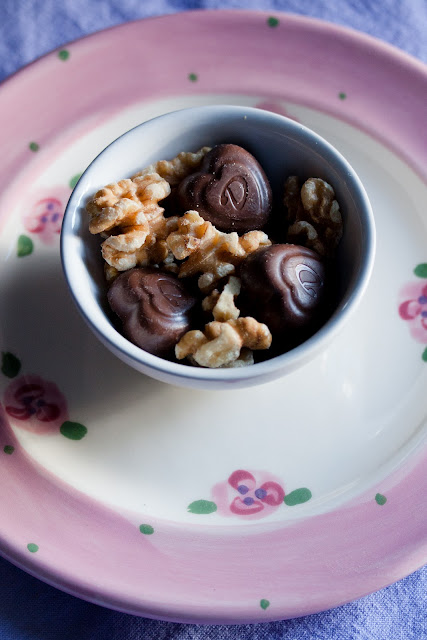 They look so tempting and that's what food photography is all about. I think the difference is a combination of the things you mentioned: composition, lighting and mood. With the surroundings of your dish (a table, some cutlery) you can set the atmosphere which the viewer would associate with the photograph. It could be a posh diner, a casual party, a fancy kitchen... With the lighting you can ad to this atmosphere by mimicking the occasion of the dinner. You could give a sense of a lovely diner in the garden on a beautiful summer evening, a picknick in the park, or a dinner by candle light. (ever noticed how a dish looks completely different in the kitchen than it does while you serve it to your family at the barbecue in the lovely sunlight). I believe food photography is about what the viewer associates with the photograph. If you, as a photographer can control that association you will create fabulous food photographs. For me Jamie Oliver is a good example of that. He's very passionate about his cooking in a very casual way. Whenever you watch him on television the camera work and lighting match that style. The photographs in his books are a brilliant representation of what he expresses while cooking. In this particular series I like the composition of #1 the best because in the other two the background is a bit too distracting. On the other hand in #3 the lighting looks much more alive. See how that single leaf standing up near the middle looks very appealing? Nevertheless I'd love a little taste of this Watercress soup ;-) |
|
|
|
Post by The Wirefox on Apr 9, 2012 18:36:38 GMT
The colours look spot on to me Katy but I do agree with Mike about the setting. I think the problem is you are dealing with two things that you really love and both are competing - the food and the traditional settings. For the food I always think it looks best in a minimalist setting. Plain white or white and black. The images are technically good though. They just need a slight lift to my eye..dragging the white point up at the r/h end of the tonal curve would nail it I think.
|
|
|
|
Post by The Wirefox on Apr 9, 2012 18:41:22 GMT
Whoops Jeroen posted at the same time..I have to agree with what he is saying too  ...apart from Jamie Oliver... he should be put under the counter along with tobacco and certain 'art' magazines. I do not care much for food nazis. He is the culinary equivalent of Oswald Mosely ;D |
|
|
|
Post by Stevewebb on Apr 9, 2012 19:48:55 GMT
For me it's all about the angle of view in making a successful food photograph. Obviously the composition and lighting have to be right but to me there is no point having all this nailed if you take a photo from dead overhead and kill all the textures.
For this reason number 3 is the winner for me Katy. The combination of the angle of view, the more narrow depth of field and the hints of the other items in the composition without being too busy, make for a recipe book quality image.
Just my 2 cents.
|
|
|
|
Post by katynoelle on Apr 10, 2012 0:54:14 GMT
Here I am to respond but the boys, apparently, need the computer immediately! But this is just super input! Thanks so much, you guys!!! Catch you later... Oh, and I just 'fixed' #3 up above (I hope.... |
|
|
|
Post by Barry on Apr 10, 2012 7:04:40 GMT
Well It seems it has all been said, I too prefer image 3 mainly due to the angle of view, and the fact that you have cropped all the non important items (spoon and bowl), which is making the soup stand out more. Although I did wonder if a crop off the top, would make the soup more stronger within the image, I guess it is down to whether you are pushing the soup or the place setting as well.
|
|
|
|
Post by katynoelle on Apr 10, 2012 14:38:55 GMT
Yes, maybe I do. If you look in the food magazines or even Google Image 'Food' you'll see that most of the images are cropped quite tightly on to the plate. I'm sure that the techniques that you use for your flower shots would also translate well to food. I've noticed how a lot of food photography is, indeed, cropped in very tightly - not afraid to chop off part of the plate, etc. I'm, also, appreciating that, sometimes, in my favorite photographers' work, there's tons of space in the composition, too. I so easily shoot from the same distance on all of my shots - I love to go in close. examples: www.flickr.com/photos/kingabw/annawilliamsphotography.com/#/PORTFOLIO/FOOD%20I/1/www.flickr.com/photos/cannelle-vanille/Of course... But, the natural light has been very flat, lately. well, my efforts aren't completely wasted, then.  This is the hazard that I'm finding with food photography - afterwards, I have to eat it.  |
|
|
|
Post by katynoelle on Apr 10, 2012 16:34:57 GMT
Thank you so extremely much, all of you, for taking the time to respond like this! Good thoughts, indeed! I've really taken in what's been said and I'm just going to respond in a scattered way, if you don't mind. Jeroen, I can't believe that you remember that chocolate. I was embarrassed about that one, somehow, but I've had two compliments on it from photographers that I respect (one, being yours  . Don't know what to think about that.  but, that's just sort of silliness! The first thing that I think, from all of your comments, is that I need to make more soup! It's a light and earthy soup. Watercress is a bit peppery and there's, also, a dash of cayenne and nutmeg (and white wine) in it that makes it light enough for spring but with a warming kick to it that we need in these still chilly days. Plus, there's that gorgeous spring green color of it. So, that's why, in the first attempt, I tried it with the spring colors and fresh eyelet napkin. But, then, thinking about it further, the next day, I went for the more earthy natural - the neutral cloths and the just budding out branch that represents fresh spring! Also, after some more thought, I don't think that the second two are too busy - there are really only two colors, here, - the neutrals and the greens with just a tiny ping of spring pink and so I think that keeps it all simple enough. I think that all of your observations about the light in the last one and the textures (SteveW, that was an interesting and good insight is what makes it work better than the other two. Also, my sister (the trained artist  and I just had a wonderful phone conversation about composition in food photography. She's been on my case (bless her heart ) about bullseyes and circles in my compositions. So, she prefers the elliptical shape in the last. My thought, when I was 'shooting' it, was that the angle was too low and we can't see the soup as well, but, actually, now, I wish that I had gone a bit lower and not been so obvious and straight on about it all. Anyway, I really wish that all of you could have been in on our conversation - it was so good - so helpful. I was saying that a lot of food photography was from overhead with circles but, then, looking again, even if it's a round plate or bowl, it's broken up by the leading line of spoons or cut off by the edge of the frame or a string of bowls (circles) that form an arc or S curve or other elements in the frame leading our eyes around. Anyway, I think that I'm rambling a bit, here, but it's all very interesting. The good photographers make it look so natural but there's more to it than is obvious. Love it! I have all sorts of light bulbs going on from this and, right at the moment, I cannot even begin to explain how much I appreciate all of your input and help! |
|
|
|
Post by katynoelle on Apr 10, 2012 16:40:11 GMT
I did these just a short while back. I was simplifying. They're too simple, though, possibly. I wish that I had included some of the pearl onions that I had added after I took the pics or some sprigs of thyme (which I didn't have at the moment - it being still wintery snow over my herbs. ) Spicy Bourbon Pot Roast:   I can't wait to look up Jamie Oliver, now. |
|
|
|
Post by clactonian on Apr 10, 2012 17:23:20 GMT
Stop it, now!!!!!!
|
|
|
|
Post by katynoelle on Apr 10, 2012 17:50:16 GMT
;D ;D ;D
|
|


 . Don't know what to think about that.