Alright, SO..... I really had to take some time to sort out my reactions to your comments. Phew! and, had a lovely discussion with my sister and, the end result is, I learned so much from this!

There's a lot here to read.... and, why not? Read it if you want to and, if not - okay!
(There's an extemely brief 'summary' of this in the next post on the next page.

)
Now, the first deal is, it's mostly a color story.... I love yellow and purple in all of it's subtle forms (it's the color scheme in my living room, at the moment - with dashes of red) but, adding so much yellow would completely change the story to spring or Easter or, even, possibly, a young girl's birthday party. I, actually, used split toning and a little wb to tint everything so that there would be a glow that was the color of crushed blueberries. There is that bit of yellow, though, in the center of the pansies, and that bit of warmth does make the pansies ping a bit. I wanted to keep it cool but my sister suggested a gold fork would have been enough to make it ping. Our thoughts evolved from there but that will come with the first revised image.
The silver plate was to keep it cool and, also, to bring out the feeling about this torte - it's a sophisticated taste (with the taste and texture of the almonds and the creme de cassis in the filling.) and the calico print was to play up that it's still homemade and, also, the sense of 'fancy for the farmhouse'. With the mint and deep colors of the berries and the simple friendliness of the berries, it has the style and feel that I was going for to tell the story. I had more props but...
I changed my location from where I was taking food pics, last spring. This time, table was higher - in a bay window, in fact. The light was on the other side of the house from where I was and it was diffused but... not as strong as I wanted. (How does one make sunlight stronger?) I used something to bounce the light back but, wish the light had been even better. btw, Of course I have a diffuser - geesh! ;D
The point is - it would be so pleasant if I could just simply move the light source to where I want it - instead of having to move the table - the product and my camera to fit the one light source. It didn't work in the cramped space of the bay window. I need a studio! ;D
So, trying to work in the small space with the tripod, that normal height table, and the prime - I couldn't back up enough! I couldn't get the angles that I wanted (even with the chair I was standing on - which didn't fit - wish I had wings!) and I couldn't work more of the props into the compositions. That's, also, why everything is so close up! Next time, I'm going to use the table that's just below knee level - it's long and narrow, though, and very awkward. Perhaps, I can add a square board on top. Also, I'm going to use my 18-55mm lens more, even though it doesn't have a low enough dof.
and, I have to say something.... I'm working on mood boarding the image early because trying to make the food, style the food, think creatively with the camera and think creatively with the setting is EXHAUSTING! So, I'm thinking that I might, also, work on composition and setting, the day before - with empty bowls and plates! I just need to keep practicing!!!
The brightness! It was really too bright - to the detriment - and I'm not quite sure why. Like I said above, I think that I was pushing it A) because I was thinking 'high key' and B) because, that's just what I have to do when I go from Lightroom to the internet and C) Of course, a bright blue tint is a bit piercing (like a high pitch can be.)
SO!
original:

My sister had the insight that, with everything in the same color tendency, it's hard for our eye to find a resting place (I think that this is what Chris is getting at with the complementary yellow idea.) So, we came up with this idea to simplify and to help the eye find a subject to latch on to.
edit:

The second one:
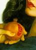
Actually, on the original of this one, I had warmed up the white balance to bring out the yellow of the center and, also, had, already, toned down the calico with the brush and graduated filter in LR. I saw, in the first place how that helped the slice stand out more and that's the one that you liked the best. I don't need to focus stack - that would just be silly...


because I simply forgot to try a higher dof (I should have!) - it's at f2.8 in this one. But, also, I like the low dof style of food photography! However, I think that this should be all about the yummy gooeyness of the center of the cake and it was just too bright to read it - SO, I did some more work with the brush tool and insisted on toning down the frosting and bringing out the filling. It's a bit of a bride white and groom dark dilemma, here. i think that there's some improvement, anyway.
first one:

edit (it's kind of hard to tell the difference - I wish my focus point had been farther back - live and learn!

)

Suzy (my sister) and I discussed the center of the cake - yellow compliment. Also, with the slice gone, it adds more story... and, at this point, the slice really was gone. (yum!!

It was later than the first set and the light was really going. There's too much noise on the center of the cake to bring it out more. Sis suggested the focus might have been on the filling. I was simply trying to get a lovely curve with the napkin and constrained by space, again!
Also, we talked about composition. We've talked about the tension created when something is 'almost' touching (like Adam and God on the ceiling of the Sistene chapel - it would be boring it the fingers were actually touching and the tension calls attention to the whole point of the story - we call it 'the Adam thing'.

Sound kind of 'wrong' doesn't it...

) Tension on the edge of the frame, though, is not where we want it! However, it wasn't bothering her. She, actually, wanted to see more edge and the rest of the blueberry. thing is, I'm out of space with what's in the image. Drat! and, I'm, also, out of time!
Firstly:

edited:

Later Gators!


 Then again, I'm a bloke who loves gadgets so I would get the studio every time ;D


 It was later than the first set and the light was really going. There's too much noise on the center of the cake to bring it out more. Sis suggested the focus might have been on the filling. I was simply trying to get a lovely curve with the napkin and constrained by space, again!