|
|
Post by manthos on Sept 25, 2011 22:19:29 GMT
|
|
|
|
Post by jiro on Sept 25, 2011 22:54:21 GMT
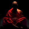
Wow. The light and the color hues are really very nice on your image, Giannis. I like it a lot. The good thing about your shot is that the colors complements the "mood" or the feeling of the scene. Also, I don't mind that you broke the rule of thirds here because technically... it worked! On another subject, IMO, I would probably darken or maybe clone out the bright object on the lower left foreground as it is getting too much attention though its presence is not much relevant to the whole scene. I would keep the bright reflection of the diagonal element but not the other object. Your shot made me solidify my belief that it is really the play of light and shadows that separates an ordinary shot to a stunning photograph. Yours is simply stunning to me. Congrats on a job well done.  |
|
|
|
Post by manthos on Sept 25, 2011 23:39:39 GMT
Thanks Jiro! Also, I don't mind that you broke the rule of thirds here because technically... it worked! I seem to break that rule pretty often. I realise now that I don't have that in my mind when I shoot. I frame my shots mostly by instinct. Maybe that's a bad thing some times...  On another subject, IMO, I would probably darken or maybe clone out the bright object on the lower left foreground as it is getting too much attention though its presence is not much relevant to the whole scene. Thank you for giving me a reason. I played with the idea of removing it but eventually was stuck with that. |
|
|
|
Post by rasbury on Sept 26, 2011 0:51:11 GMT
Red sky at night,sailors delight.This is a delightful photo Giannis.I do like the colors of the sky and the shirts on the individuals compliment them very well.As far as contrast issues,maybe a tad to much on the water,other than that it looks good to me.
|
|
|
|
Post by Kit on Sept 26, 2011 1:16:26 GMT
This is just a stunner and the slightly over the top colour doesn't detract one bit. Those brilliant "arrows" in the sky are great - a wonderful bit of serendipity. Like Willie, I'd edit out or at least dull down that bright object in the lower foreground, but keep the diagonal. Altogether a very well seen and developed image.
|
|
|
|
Post by katynoelle on Sept 26, 2011 1:32:28 GMT
Just wowzer! I like the touch of blue in the guy's shirt (I mean and all of the vivid colors and the mood and atmosphere, etc. but the others have already said that. ;-) )
|
|
|
|
Post by seriche on Sept 26, 2011 6:27:31 GMT
Gorgeous image  You successfully broke another 'rule' by not having the people look into the scene, but the way you have them oriented works to make the image even more interesting. (When I visualise them looking to the left, it doesn't work at all). As they are, it leaves me wondering what they're looking at, which is better than knowing the answer |
|
|
|
Post by muckergee on Sept 26, 2011 7:21:41 GMT
Manthos, mate, I think the colours are a bit over the top, the contrast too. I would have made the two guys in the foreground more prominent. Crouching down (low view point) would have eliminated the Black of the dock. With your camera mate, you have to get closer to subjects. You have the "eye", dude. Keep it up  |
|
|
|
Post by manthos on Sept 27, 2011 23:03:46 GMT
Thank you all. Your comments are very helpful. With your camera mate, you have to get closer to subjects. Could you explain this Mick? Thanks in advance! |
|
|
|
Post by Stevewebb on Sept 28, 2011 8:21:02 GMT
really nice image. At first I thought you had overcooked the colours but on a second look I think it was the right choice to leave them as they are.
|
|
|
|
Post by muckergee on Sept 28, 2011 8:42:51 GMT
Of course mate ... You use a point and shoot.
|
|
|
|
Post by manthos on Sept 28, 2011 22:49:38 GMT
Of course mate ... You use a point and shoot. I didn't mean this. ;D How would, getting closer to the subject, enhance an image? Why would you like a bigger subject in the frame? |
|


 ). I would like to hear your thoughts. I fear I gave it too much contrast?