

Post by jeroenk on Oct 16, 2011 20:18:14 GMT
This tutorial is the first of a series of two tutorials which will focus on Black and White photography. The focus on shooting BW images in particular and the second part will focus on the conversion from colour to BW in post processing. The second part can be found here.
Shooting in black and white
In the early days of film photography Black and White was the only appearance of a photographic image. Ever since the colour film was created the appearance of photographic images is divided in colour images and BW images. Where the creation of colour images lies closer to the world you see around creating BW images might be a little less intuitive.
The common mistake in BW photography is that the post processing (only) makes the BW image, and therefore this first tutorial will focus only on the shooting itself.
Important components in BW photography
Quite obvious in BW photography is that you can’t directly use colours to create your images. Consequence is that other components like composition, light, contrast and tonal range become much more important tools. Dependant on your personal taste BW photography could be ‘easier’ than colour photography because you don’t have to worry about getting the colours right. It could also be more difficult because colours naturally appeal to people. For example a sunset will appeal to everybody just because of the colours. This clearly states the essential difference between BW photography and colour photography.
Where to start
As stated above creating an effective BW photography might be less intuitive than a coloured one. Therefore the most important part of BW photography is pre-visualizing the shot. When you know what you want your photograph to look like and you can visualize what the final shot will be, you can (pre) arrange the photograph much more effectively.
To effectively pre-visualize a BW image you should be able to see colour and brightness completely separated from each other because different levels of brightness (varying from white to black) will be the only thing left after conversion.
For example the next picture of this bird statue:
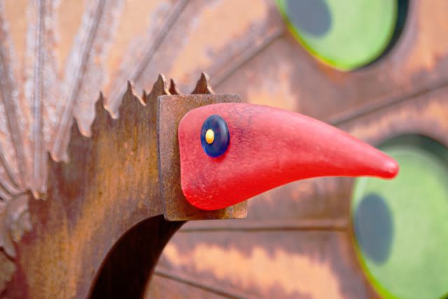
Bird Statue - Colour
At a first glance the red beak draws the attention. It has enough separation from the green circles in the back and the brown/orange background. When you convert this picture straight into BW it looks like this:
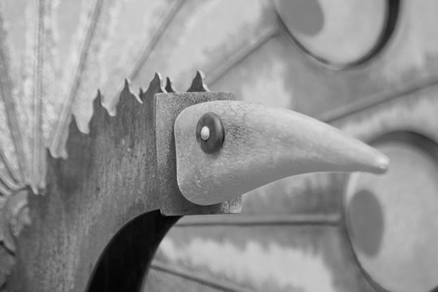
Bird Statue - BW
Now the beak doesn’t really draw that much attention. The background is quite similar to the foreground and the BW version isn’t appealing at all.
As you have a second (or third ) look at the colour version you can see that the brightnesslevels aren’t very different from each other. The only reason why the beak stands out is because it’s in focus but, more importantly, it’s red. Red is a colour that naturally appeals to human.
Help with visualizing
Visible in the previous example is that there’s a lot of gray areas in the photograph. Therefore the photograph doesn’t look very appealing. A very useful tool to get a sense of brightness in an image is the histogram.
The histogram
The histogram (in photography) is a diagram that visualizes the different brightness levels with their relative share in the image. Horizontally placed are the 255 different brightness levels. At the left there is level 0 which represents plain black. At the right there is level 255 which represents plain white. Vertically placed is the relative amount of pixels which have that specific brightness level.
This is what the histogram from the "Bird Statue - Coloured" looks like.
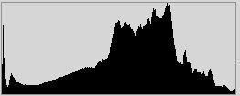
Histogram from "Bird Statue - Coloured"
Obvious is that most of the pixels are at approximately the middle brightness values. This refers to a gray lightness.
Since contrast is an important tool for creating a strong BW image a good histogram has a wide spread of brightness levels. The preferred exact shape depends on the appearance of the image and therefore on personal taste.
A higher contrast BW photograph with its histrogram looks like this:
By Jeroen Knippenberg

Histogram by above photograph
Tonal range
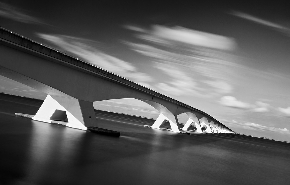
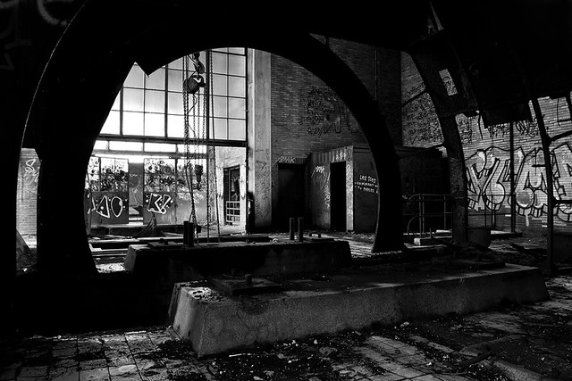
The range of brightness values an image covers is called tonal range. For the impact of a BW photograph is this an important component. Covering the entire tonal range is important to avoid a plain look of your photograph. The BW version of the Bird statue has quite a lot of pixels in the middle gray area which creates this plain look. The impact of a BW photograph is mainly determined by the highlights and shadows and the balance between them.
As you can see in the industrial shot above the dark areas create the mood of the picture and the highlights draw the viewer’s attention. The histogram shows the dominance of dark tones at the left of the histogram and the peak of highlights at the right.
Where normally peaks at the left and right hand site of the histogram imply respectively under- and over exposure, I find that in BW photography a little of this can be applied for more impact.
Camera BW modus
About every camera has a BW picture style in which it’ll take full BW photographs instead of regular coloured ones.
It might be odd to place this BW modus under visualizing help instead of shooting techniques. But there’s enough reason to not use the BW camera modus when shooting for BW photographs. In part 2 of this tutorial series I’ll explain in detail why but for now I’ll stick with ‘it leaves open much more possibilities in the post processing conversion’ when shooting BW intended images in colour.
Where the camera BW modus comes in rather useful is at the pre-visualizing stage. What’s easier than just take a look at your camera LCD screen to see roughly what the final BW image will look like? It’s easier this way to do the pre-visualizing if you have trouble with seeing what the final image will look like. Though it’s better to train your pre-visualizing skills otherwise BW photography is going to be a trial and error process of shooting and looking at your LCD screen.
This training in pre-visualizing will improve your overall photography skill in BW photography as well as in colour photography.
Composition, lighting and mood
As stated before composition and lighting becomes more important when colours are absent. I find that forms and shapes merge very easily with contrast in BW photography.
By Keith Aggett
BW photography is a good practice to improve your overall lighting and composition skills.
Mood
Somehow applying BW can creates an intense atmosphere. You often see it used in intriguing portraits, documentary series or photographs of old decay places.
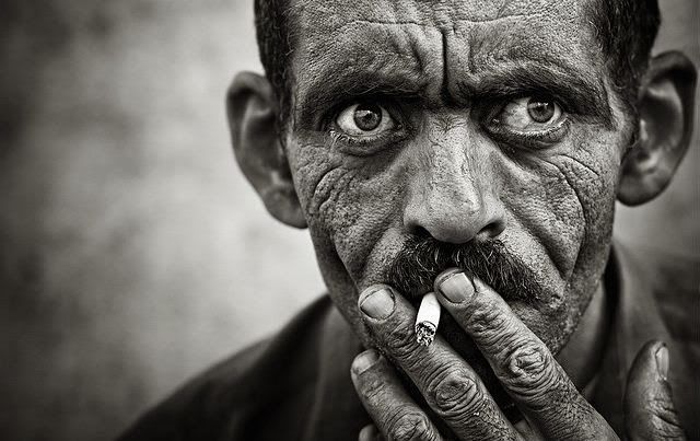
By Slim Letaief
Of course it’s all about taste but BW is commonly used for those occasions and it works well.
Tips and Tricks
Besides the area’s covered in this tutorial there are some more tips and tricks to help improve your BW shots:
So far the tutorial about BW shooting. All of the above should be applied when shooting for an intended BW shot. The conversion from the original colour version into the final BW image will be covered in the next part of this tutorial.
Shooting in black and white
In the early days of film photography Black and White was the only appearance of a photographic image. Ever since the colour film was created the appearance of photographic images is divided in colour images and BW images. Where the creation of colour images lies closer to the world you see around creating BW images might be a little less intuitive.
The common mistake in BW photography is that the post processing (only) makes the BW image, and therefore this first tutorial will focus only on the shooting itself.
Important components in BW photography
Quite obvious in BW photography is that you can’t directly use colours to create your images. Consequence is that other components like composition, light, contrast and tonal range become much more important tools. Dependant on your personal taste BW photography could be ‘easier’ than colour photography because you don’t have to worry about getting the colours right. It could also be more difficult because colours naturally appeal to people. For example a sunset will appeal to everybody just because of the colours. This clearly states the essential difference between BW photography and colour photography.
Where to start
As stated above creating an effective BW photography might be less intuitive than a coloured one. Therefore the most important part of BW photography is pre-visualizing the shot. When you know what you want your photograph to look like and you can visualize what the final shot will be, you can (pre) arrange the photograph much more effectively.
To effectively pre-visualize a BW image you should be able to see colour and brightness completely separated from each other because different levels of brightness (varying from white to black) will be the only thing left after conversion.
For example the next picture of this bird statue:
Bird Statue - Colour
At a first glance the red beak draws the attention. It has enough separation from the green circles in the back and the brown/orange background. When you convert this picture straight into BW it looks like this:
Bird Statue - BW
Now the beak doesn’t really draw that much attention. The background is quite similar to the foreground and the BW version isn’t appealing at all.
As you have a second (or third
) look at the colour version you can see that the brightnesslevels aren’t very different from each other. The only reason why the beak stands out is because it’s in focus but, more importantly, it’s red. Red is a colour that naturally appeals to human. Help with visualizing
Visible in the previous example is that there’s a lot of gray areas in the photograph. Therefore the photograph doesn’t look very appealing. A very useful tool to get a sense of brightness in an image is the histogram.
The histogram
The histogram (in photography) is a diagram that visualizes the different brightness levels with their relative share in the image. Horizontally placed are the 255 different brightness levels. At the left there is level 0 which represents plain black. At the right there is level 255 which represents plain white. Vertically placed is the relative amount of pixels which have that specific brightness level.
This is what the histogram from the "Bird Statue - Coloured" looks like.
Histogram from "Bird Statue - Coloured"
Obvious is that most of the pixels are at approximately the middle brightness values. This refers to a gray lightness.
Since contrast is an important tool for creating a strong BW image a good histogram has a wide spread of brightness levels. The preferred exact shape depends on the appearance of the image and therefore on personal taste.
A higher contrast BW photograph with its histrogram looks like this:
By Jeroen Knippenberg
Histogram by above photograph
Tonal range
The range of brightness values an image covers is called tonal range. For the impact of a BW photograph is this an important component. Covering the entire tonal range is important to avoid a plain look of your photograph. The BW version of the Bird statue has quite a lot of pixels in the middle gray area which creates this plain look. The impact of a BW photograph is mainly determined by the highlights and shadows and the balance between them.
As you can see in the industrial shot above the dark areas create the mood of the picture and the highlights draw the viewer’s attention. The histogram shows the dominance of dark tones at the left of the histogram and the peak of highlights at the right.
Where normally peaks at the left and right hand site of the histogram imply respectively under- and over exposure, I find that in BW photography a little of this can be applied for more impact.
Camera BW modus
About every camera has a BW picture style in which it’ll take full BW photographs instead of regular coloured ones.
It might be odd to place this BW modus under visualizing help instead of shooting techniques. But there’s enough reason to not use the BW camera modus when shooting for BW photographs. In part 2 of this tutorial series I’ll explain in detail why but for now I’ll stick with ‘it leaves open much more possibilities in the post processing conversion’ when shooting BW intended images in colour.
Where the camera BW modus comes in rather useful is at the pre-visualizing stage. What’s easier than just take a look at your camera LCD screen to see roughly what the final BW image will look like? It’s easier this way to do the pre-visualizing if you have trouble with seeing what the final image will look like. Though it’s better to train your pre-visualizing skills otherwise BW photography is going to be a trial and error process of shooting and looking at your LCD screen.
This training in pre-visualizing will improve your overall photography skill in BW photography as well as in colour photography.
Composition, lighting and mood
As stated before composition and lighting becomes more important when colours are absent. I find that forms and shapes merge very easily with contrast in BW photography.
By Keith Aggett
BW photography is a good practice to improve your overall lighting and composition skills.
Mood
Somehow applying BW can creates an intense atmosphere. You often see it used in intriguing portraits, documentary series or photographs of old decay places.
By Slim Letaief
Of course it’s all about taste but BW is commonly used for those occasions and it works well.
Tips and Tricks
Besides the area’s covered in this tutorial there are some more tips and tricks to help improve your BW shots:
- Go out with the intention to shoot BW. Don’t do anything else on that occasion. Select the results with BW conversion in mind and apply the conversion to all of the selected shots.
- Never go for a colour and BW version for a single photograph. If the photograph itself isn’t shot with a preference for one of the two choose between a colour or BW version and stick to that single version.
- Where you normally might avoid mid-day photographing for the harsh lighting and the rather hazy colours, it’s good to try mid-day shoots with a BW approach. The harsher lighting can give a stronger contrast which can, if applied correctly, works very well.
So far the tutorial about BW shooting. All of the above should be applied when shooting for an intended BW shot. The conversion from the original colour version into the final BW image will be covered in the next part of this tutorial.