janis
Working With A Pro
[Mo0:0]
Posts: 898
|
Post by janis on Jun 16, 2013 2:20:11 GMT
I think I need a little bit more contrast in the lower flower, but other than that, what say you? I used Enhance Foliage and applied selective Tonal Contrast to the flowers in ColorEfex Pro.  |
|
|
|
Post by chrisc on Jun 16, 2013 3:08:00 GMT
Interesting. I have never seen the likes of such a thing.
|
|
janis
Working With A Pro
[Mo0:0]
Posts: 898
|
Post by janis on Jun 16, 2013 4:20:33 GMT
Maybe it's just the perspective. Do you recognize it now?  (Also open to critique.) |
|
janis
Working With A Pro
[Mo0:0]
Posts: 898
|
Post by janis on Jun 16, 2013 6:02:41 GMT
Or now?  |
|
|
|
Post by Stevewebb on Jun 16, 2013 6:44:49 GMT
The first one is a very unique perspective, I like it very much. Although I think it doesn't need quite so much space above or below it so maybe you could square crop it or even 3:2 ish but lanscape orientation (might just fit but I haven't tried it)
I also like number 3. That seems to have the focus in just the right place and the background is lovely and creamy.
|
|
|
|
Post by chrisc on Jun 16, 2013 10:53:03 GMT
I like #3 as well. I recognized a pine cone in the making but have never seen one quite so red nor with needles that short. I like the perspective on the first one best, but have to agree as to a crop ratio better suited to focus on the cone and not allow the eye to wander around that much dead space.
|
|
|
|
Post by chrisc on Jun 16, 2013 11:13:55 GMT
I did a slight contrast adjustment to the pinecone pod needles and to the crop...just a tiny adjustment.  |
|
janis
Working With A Pro
[Mo0:0]
Posts: 898
|
Post by janis on Jun 17, 2013 2:01:04 GMT
Chris and Steve: thanks for your feedback. I understand why you are urging the crop on #1 and will no doubt come around to your view in the end, but am for the moment just enjoying cream with my coffee.
I am delighted you both like #3. You can't read the EXIF data, but it was shot at 2800 ISO on a D7100. Never mind the weatherproofing, the nice bright LCD, and all the other bells and whistles, the fact that I can produce a decent photo in low light with my 105 mm macro handheld--well, that alone makes this upgrade worthwhile.
|
|
|
|
Post by kenc on Jun 17, 2013 18:43:08 GMT
The first is nice as is - agree about a squarish crop.
|
|
janis
Working With A Pro
[Mo0:0]
Posts: 898
|
Post by janis on Jun 17, 2013 23:22:46 GMT
Thanks, Ken, but I wish you all hadn't made me do this... 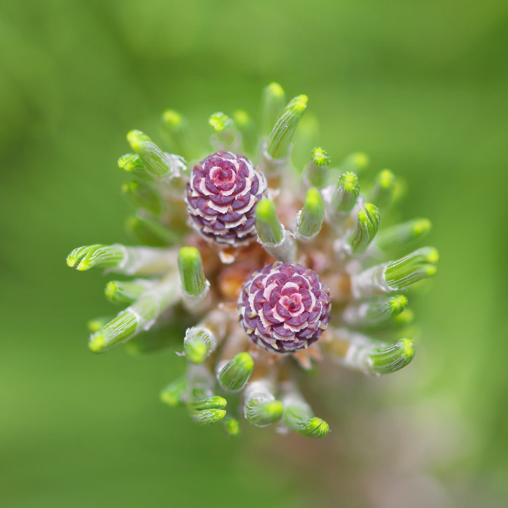 Now I see that there are artifacts from the processing (see especially the needles around the upper flower). What caused that effect and what do I need to do in processing to avoid (or correct) it? |
|
|
|
Post by Stevewebb on Jun 18, 2013 6:25:12 GMT
I wouldn't be too hard on yourself as its not that noticable to me.
To try and avoid it.....hmmm not sure. It may have come from the sharpening or detail sliders so you could try them and them paint them in selectively in the centre.
|
|
janis
Working With A Pro
[Mo0:0]
Posts: 898
|
Post by janis on Jun 18, 2013 14:47:27 GMT
Thanks, Steve; I may just have to start from scratch and pay closer attention to what is happening.
|
|
|
|
Post by chrisc on Jun 18, 2013 19:02:41 GMT
Is this a stacked image?
|
|
janis
Working With A Pro
[Mo0:0]
Posts: 898
|
Post by janis on Jun 18, 2013 21:15:40 GMT
No, just a close-up shot at f/5.6. I'm pretty sure the haloing (couldn't for the life of me think of that word last night) crept in when I applied the Foliage filter. If I remember right, what I did was 1) Reduce Noise using Dfine 2) Presharpen in-focus parts of cones and needles with Nik software 3) Apply CEP4 Foliage filter to entire image and Tonal Contrast filter just to the areas more or less in focus 4) Sharpen in-focus areas |
|
|
|
Post by chrisc on Jun 20, 2013 1:08:23 GMT
CEP 4 contrast only layer...  |
|