|
|
Post by robmarshall on Dec 5, 2011 21:48:40 GMT
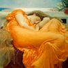
This was shot with a studio flash-head fitted with a soft box, placed directly behind the glass and bottle. They are standing on a sheet of white reflective perspex. The water has blue food dye added to match the colour of the bottle. The lengths I go to!   |
|
|
|
Post by The Wirefox on Dec 5, 2011 21:59:32 GMT
Outstanding product shot Rob. Maybe the bottle need to be rotated to show the full name but the lighting and the blue are just spot in. I was in two minds about the blue shadow until I viewed on black. On black it really works. nothing else to say on this...very impressed  |
|
|
|
Post by katynoelle on Dec 5, 2011 22:17:14 GMT
Wow! This is absolutely gorgeous!
|
|
|
|
Post by Barry on Dec 5, 2011 22:17:44 GMT
Very effective, clean and simple. Although I would had removed the purple halo effect at top and bottom of bottle, and left hand side of glass.
I did not realise that if you clicked on a image, you can view it on black.
|
|
|
|
Post by The Wirefox on Dec 6, 2011 6:59:29 GMT
I did not realise that if you clicked on a image, you can view it on black. Thanks to Jiro. He sorted the code for the light box but you need to use the upload techniques described here fstop-cafe.proboards.com/index.cgi?board=howto&action=display&thread=4But read Rob's notes at the bottom of the thread. The right click method for flickr. Also with Smug and Photobucket grabbing the 'Link' from the link box will display on black automatically. |
|
|
|
Post by chrisc on Dec 6, 2011 11:22:43 GMT
|
|
|
|
Post by robmarshall on Dec 6, 2011 18:26:00 GMT
It's just some glare coming off the edge of the glass because the light is coming directly from behind. I thought it was quite good, as I was looking for a slightly surreal look. |
|
|
|
Post by katynoelle on Dec 6, 2011 18:52:49 GMT
It's really pleasing how the edges almost look 'sketched' with a black marker.
|
|
|
|
Post by The Wirefox on Dec 6, 2011 20:21:12 GMT
The glare does not bother me but now you have pointed it out the inconsistency of the glare leading to the slight bulging out of the black of the bottle edge is now catching my attention. The problem is that the more outstanding the image the easier it is to see any very minor issues that would otherwise go unnoticed in a lesser image.
|
|
|
|
Post by robmarshall on Dec 6, 2011 21:25:50 GMT
It's really pleasing how the edges almost look 'sketched' with a black marker. It's just the shadow cast by the light behind the subjects. Had I put a light on the front of the image as well as the back light, it would have lost that shadow detail and, I think, a lot of the detail that makes it a bit different. Just experimenting! here is another example that I did the other day, with just a plain glass using the same setup.  |
|
|
|
Post by jeeperman on Dec 6, 2011 22:33:33 GMT
I really did not notice it until it was pointed out, but don't feel it distracts me from the image. A fine image indeed. The blue is one of my favorite colors and as said looks fantastic on black.
Interesting note on the color: nearly a Colbalt blue. There was a study I read some time ago that claimed that Colbalt is the color which affects us males. Appearently even if our favorite color is red....when we view Colbalt our eyes dialate and we become more interested in the presentation/subject.
|
|
|
|
Post by chrisc on Dec 6, 2011 23:36:36 GMT
The only time I remember cobalt blue affecting a behavior was in New Orleans where a bevy of beauties paraded down the street painted as if to be wearling clothes. paintedbody.org/viewer.jsp?dirName=clothes&picNum=15&picTotal=43I am quite sure my eyes dialated, breathing sucked in tight and heart raced just a little. After all, I was but a wee lad. |
|
|
|
Post by jeeperman on Dec 6, 2011 23:45:56 GMT
LOL! i here ya Chris. The article did say that it actually affected us at a level that we would not realize and actually most not all men.
|
|