|
|
Post by The Wirefox on Sept 30, 2011 21:22:39 GMT
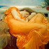
I know a few of you have seen this already but firstly I want to get more images onto the forum and secondly I wouldn't mind some more detailed critique since this was one of those images where I wasn't too sure when to stop with the processing.  |
|
|
|
Post by The Wirefox on Sept 30, 2011 21:24:19 GMT
Actually seeing this in the lightbox makes me think it needs more negative space around it
|
|
|
|
Post by robmarshall on Sept 30, 2011 22:03:02 GMT
Yes, I think more space around the subject might give it more impact. I also think distressing the face a bit might give a better blend with the tentacles(?) around it.
|
|
|
|
Post by Kit on Sept 30, 2011 23:49:07 GMT
Yes, more space, especially to the right and top to get the rest of the tentacles in. When I see it in the lightbox, there is a small area right at the bottom that has a bit of something in it that looks as though it shouldn't be there. It shows more when the screen is tilted towards me, but that's on a PC.
Other than that, this is something hard to critique, I find, because it is such a personal image. Certainly it is one I keep coming back to.
|
|