|
|
Post by Barry on Jan 11, 2012 16:25:46 GMT
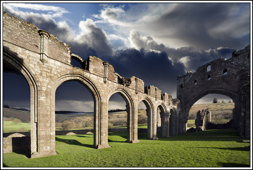
Visited Llanthony Priory a few weeks ago, and just got around to playing with some of the images.  Nikon D700, f11, 1/250, ISO200, Nikon 70-200VR lens at 70mm. |
|
|
|
Post by chrisc on Jan 11, 2012 17:43:55 GMT
It screams to be B&W...thisi s a perfect doom and gloom setup, if I ever saw one...and actually, I think I've seen three.
|
|
|
|
Post by chrisc on Jan 11, 2012 19:56:37 GMT
|
|
|
|
Post by Barry on Jan 11, 2012 20:38:57 GMT
Cheers Chris, I will have another play with this one, I did it as colour as I needed a few Colour prints for a camera club competition.
|
|
|
|
Post by The Wirefox on Jan 11, 2012 20:45:16 GMT
Barry this is very theatrical. Is it is a composite (sky)? To be honest I am not sure what I think. It grabs you on first glance and then I am left moving my head around trying to make out what is going on. I think this is one of those love/hate images but I am stuck on the oblique. The b/w conversion tones it down for sure but my eyes tend to hit the intersection of the end wall and the line of arches rather than the scene through the end wall arch...where I think I should be led.
|
|
|
|
Post by Barry on Jan 11, 2012 20:50:34 GMT
Barry this is very theatrical. Is it is a composite (sky)? Well spotted, here is the original image straight out of camera.  |
|
|
|
Post by The Wirefox on Jan 11, 2012 20:54:18 GMT
I think thats one of the problems the clouds are on a different scale to the main subject. I tell you what though you have done a cracking job from this original  |
|
|
|
Post by Barry on Jan 11, 2012 20:58:43 GMT
When I get a bit of time I will go with Chris suggestion of B&W, and maybe try a bit of Dave's 'Doom and Gloom effect' ;D
|
|
|
|
Post by chrisc on Jan 11, 2012 21:12:57 GMT
Cheers Chris, I will have another play with this one, I did it as colour as I needed a few Colour prints for a camera club competition. I did doom and gloom this a bit but backed off by dropping my d&g atop the original and slowly backing some of the color back into it, then adding one additional black adj as I thought it got too dark in the clods. Now that I see you did a composite, I understand why my controls wouldn't work uniformly...aha! I took out the last arch because I couldn't get the shadowed end to work in a way I found pleasing, but realize it probably still needs to be there to carry out the frame. |
|
|
|
Post by Antonio Correia on Jan 11, 2012 22:52:53 GMT
Nice structure. What was it ? Part of a castle ? It is not the first time I see you - or is it somebody else ? - to place new skies with great results. The new sky enhances the image very much making the landscape very dramatic even stronger in the black and white version.  |
|
|
|
Post by Antonio Correia on Jan 11, 2012 22:56:56 GMT
|
|
|
|
Post by jeeperman on Jan 11, 2012 22:59:45 GMT
Very nice work, Barry. I look forward to seeing the conversion that you come up with.
|
|
|
|
Post by Barry on Jan 11, 2012 23:06:44 GMT
Nice structure. What was it ? Part of a castle ? It is not the first time I see you - or is it somebody else ? - to place new skies with great results. The new sky enhances the image very much making the landscape very dramatic even stronger in the black and white version.  I see that you have already found this place, I don't normally insert skys, so I'm no expert at it, I think you are thinking of Cannockwolf. |
|
|
|
Post by nickjohnson on Jan 12, 2012 17:44:14 GMT
Why didn't they cloned the persons ? .... Because the last competition judge said they should have a person in the image to give it a sense of scale .....  |
|
|
|
Post by Barry on Jan 12, 2012 17:51:36 GMT
.... Because the last competition judge said they should have a person in the image to give it a sense of scale .....  I know exactly what you mean, The judge for this particular competition does not appear to have a website, so I can't even get a idea of what type of photography he is into. Anyway I have put together nine images, so hopefully there will be something in there that he will like. |
|