|
|
Post by chrisc on Apr 28, 2012 11:32:38 GMT
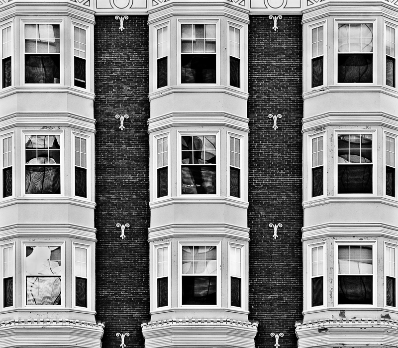
From last summer in Manchester, NH Symmetry in Motion  |
|
|
|
Post by katynoelle on Apr 28, 2012 12:23:03 GMT
Super duper, Chris!!!  |
|
|
|
Post by maryloveslucy on Apr 28, 2012 12:57:56 GMT
Looks like Manchester.  The reflections in the windows and the flaking paint add to already interesting brick and moldings. |
|
|
|
Post by Barry on Apr 28, 2012 15:04:41 GMT
Nice Rule of Thirds ;D. But I'm sure that this would work much better in monochrome, which would bring out a lot more detail, is there a reason why you had to crop in close on the outside windows, as I think seeing some more brickwork on the edges would had made for a more pleasing view.
|
|
|
|
Post by chrisc on Apr 28, 2012 15:11:39 GMT
Lots of lens distortion I had to correct for..I did a momochrome and it didn't do much for me..perhaps later when I've had a nap.
|
|
|
|
Post by katynoelle on Apr 29, 2012 0:53:11 GMT
I like the red, white and blue aspect of it.  |
|
|
|
Post by The Wirefox on Apr 29, 2012 12:51:07 GMT
Looks like Manchester Not our Manchester..there is no graffiti or discarded shopping trolleys  I really like the reflections here. Very clean and well shot image |
|
|
|
Post by chrisc on May 1, 2012 20:00:54 GMT
As a B&W  |
|
|
|
Post by Barry on May 1, 2012 20:47:50 GMT
The B&W version brings out more detail, although you may had pushed the contrast a little bit too far.
|
|
|
|
Post by Kit on May 4, 2012 23:52:23 GMT
Both versions are interesting. Probably the b & w gets a couple more points for me. Has anyone else noticed the odd visuals going on here? When I look at it, the top of the image seems wider than the bottom. I know it can't possibly be so, but the deception to my eyes continues.   |
|
pjerry
Senior Member
   Pierre[Mo0:1]
Posts: 204
|
Post by pjerry on May 5, 2012 0:24:39 GMT
The same here. Good examination shows that on the bottom are a few extra pixels on the left. But I don't know if that will explain it.
I like the coloured one most. The colours are almost "duotonous", I like that very much. Also very nice processed.
|
|
|
|
Post by jjbacoomba on May 5, 2012 1:07:07 GMT
Wow! Love it! Amazing what glass and light can give us. Love the crop. Very well done.
|
|