|
|
Post by chrisc on Apr 28, 2012 15:09:28 GMT
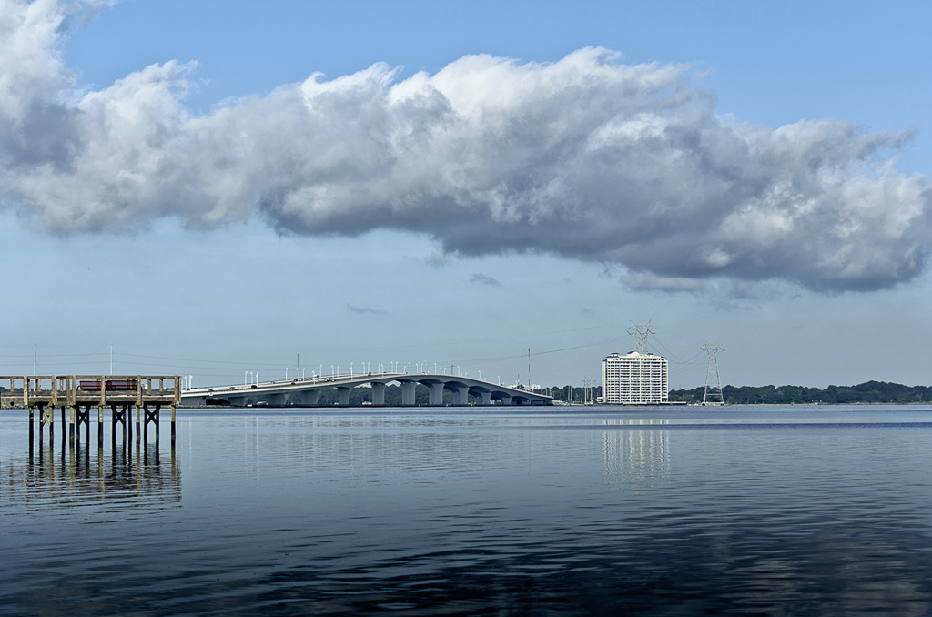
Make this shot as good as you can..  |
|
|
|
Post by Barry on Apr 28, 2012 15:24:29 GMT
Here is my take on it. Obviously gone for the monochrome look, with various amounts of contrast added using a couple of layers (more at bottom). I cropped the image to lose some of the dead space above clouds, then cropped bottom, so that horizon was on the thirds.  |
|
|
|
Post by chrisc on Apr 29, 2012 14:04:00 GMT
No crop, but here are my edits for color/sat/luminosity...   |
|
|
|
Post by Barry on Apr 29, 2012 16:46:58 GMT
I think I prefer your colour edit now.
|
|
pjerry
Senior Member
   Pierre[Mo0:1]
Posts: 204
|
Post by pjerry on May 6, 2012 23:27:47 GMT
Not really the topic, but I just used ViewNx from Nikon. I can't do very much with this program, but some improvement can be reached. I can't for example not correct the too blue-ish picture I get. A bit strange to me was, that the colours already changed the moment I started with the unedited picture. Maybe you can say something about that Chris?  LOL, the colour is again different from the one I have in ViewNx........  |
|
|
|
Post by Stevewebb on May 7, 2012 7:12:43 GMT
Just to be different.  |
|
rjbell
Member
  [Mo0:1]
Posts: 74
|
Post by rjbell on May 9, 2012 17:15:02 GMT
|
|
rickwu
New Member
 [Mo0:0]
Posts: 7
|
Post by rickwu on Jun 7, 2012 4:56:47 GMT
amazing different shots of same place. the contrast is wonderful
|
|