|
|
Post by chrisc on Aug 18, 2012 1:00:55 GMT
|
|
|
|
Post by jiro on Aug 18, 2012 4:21:50 GMT
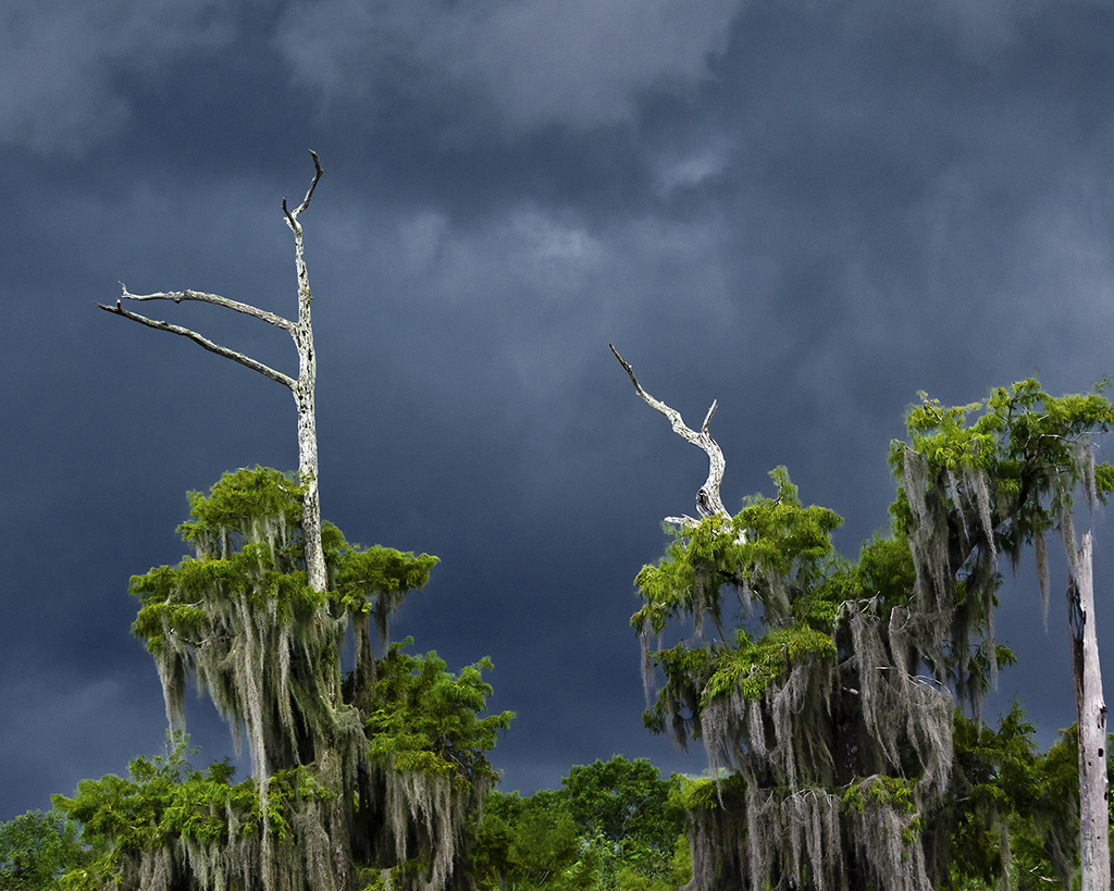
For me, the color made this shot work. I wish the green leaves are just a tad brighter but I am not sure since I have an uncalibrated cheap monitor.
|
|
|
|
Post by chrisc on Aug 18, 2012 13:16:41 GMT
I went back into this image and desaturated the sky a bit, and brightened the leaves a bit.  |
|
|
|
Post by jiro on Aug 18, 2012 13:20:22 GMT
I'd keep the same tone and contrast on #1, Chris but I like what you did on the greens at #2. My, I'm really hard to please.
|
|
|
|
Post by chrisc on Aug 18, 2012 13:34:18 GMT
|
|
|
|
Post by jiro on Aug 18, 2012 13:42:03 GMT
you somehow lost the dynamism of the green on the last edit. I was hoping you'd keep the greens from your #2 edit. This is better than #1 for me.
|
|
|
|
Post by chrisc on Aug 18, 2012 14:02:14 GMT
Because of my workflow, I'd have to do a complete redo to capture both of your liked segments...I may yet, but have a ton of other images to play with first.
|
|
|
|
Post by chrisc on Aug 18, 2012 23:42:15 GMT
This is my last edit on this image. I desaturated the blue to make the sky more believable. I like it.  |
|