|
|
Post by macromeister on Dec 5, 2012 22:45:56 GMT
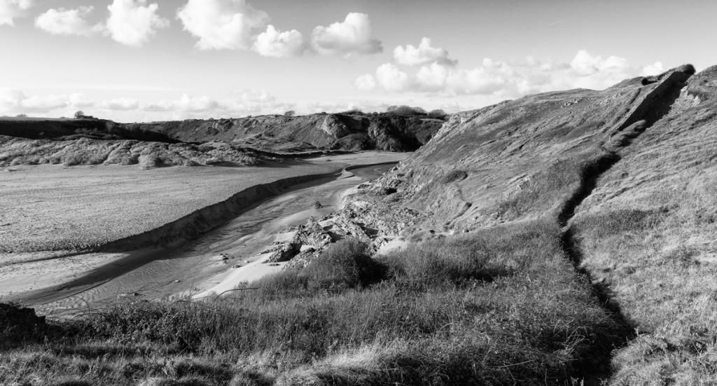
I keep going out into the countryside and shooting pretty-picture landscapes. I go out full of the artistic and noble intention of firing off some creative arty moody BW masterpieces - you know the sort of thing - all dreamy soft-focus, silly angled, emotive things. But I come home after a day out and the camera spews out this crap. I don't know where it comes from - damn Panasonic G3 - the little bugger has a mind of it's own. It ignores my artistic expression and just goes for the postcard stuff while I'm eating my sarnies on a cold stone bench. I think they should rename it the Panasonic Postcard!  Can anyone help me? All shot this afternoon without my consent. The first and last are five shot panorama stitched in CS6. About 44MP each.  Stackpole, Pembrokeshire, West Wales Stackpole, Pembrokeshire, West Wales by rob ashcroft @ www.macromeister.co.uk, on Flickr  Stackpole, Pembokeshire, West Wales Stackpole, Pembokeshire, West Wales by rob ashcroft @ www.macromeister.co.uk, on Flickr  Stackpole coast, West Wales Stackpole coast, West Wales by rob ashcroft @ www.macromeister.co.uk, on Flickr  Stackpole, pembrokeshire Stackpole, pembrokeshire by rob ashcroft @ www.macromeister.co.uk, on Flickr |
|
|
|
Post by chrisc on Dec 5, 2012 23:19:14 GMT
It did okay on three, but I'll bet you the Panasonic got beat up by your Canon and is afraid to take a decent shot...too much wide angle isn't always a good thing.
|
|
|
|
Post by jeeperman on Dec 6, 2012 1:59:17 GMT
I think the ol'G3 did fairly well. I like the wide myself. The third image I am unsure yet what to think. The land horizon being dead on the horizon.
I think the first and last are my favorites although in the first I might try a little off the right. Maybe.
In the last I would have to bring the exposure down slightly in the clouds, or maybe a bit of burning. I think there is more to be seen there.
|
|
|
|
Post by macromeister on Dec 6, 2012 18:35:35 GMT
too much wide angle isn't always a good thing. Try telling that to the boys (and it's always boys) who sell their souls to the devil for a 17-40L rather than a 24-105 in the perceived need to get as wide as possible on their full-frame sensor cameras. Personally, I find 24mm more than adequate on my 5DM2. I think there is a view that wide is better because it has more in it. But there's only so much you can take in when viewing. In #1 I couldn't really register all of that width when I was standing there yesterday. It's not much on a screen because it's physically small, but the actual size of the view was very wide. Maybe that's where photography gives a false view of reality? |
|
|
|
Post by macromeister on Dec 6, 2012 18:43:22 GMT
I think the first and last are my favorites although in the first I might try a little off the right. Maybe. Yes, it is too wide, I think. And someone suggested BW. Less width version in BW  |
|
|
|
Post by Kay on Dec 6, 2012 19:53:14 GMT
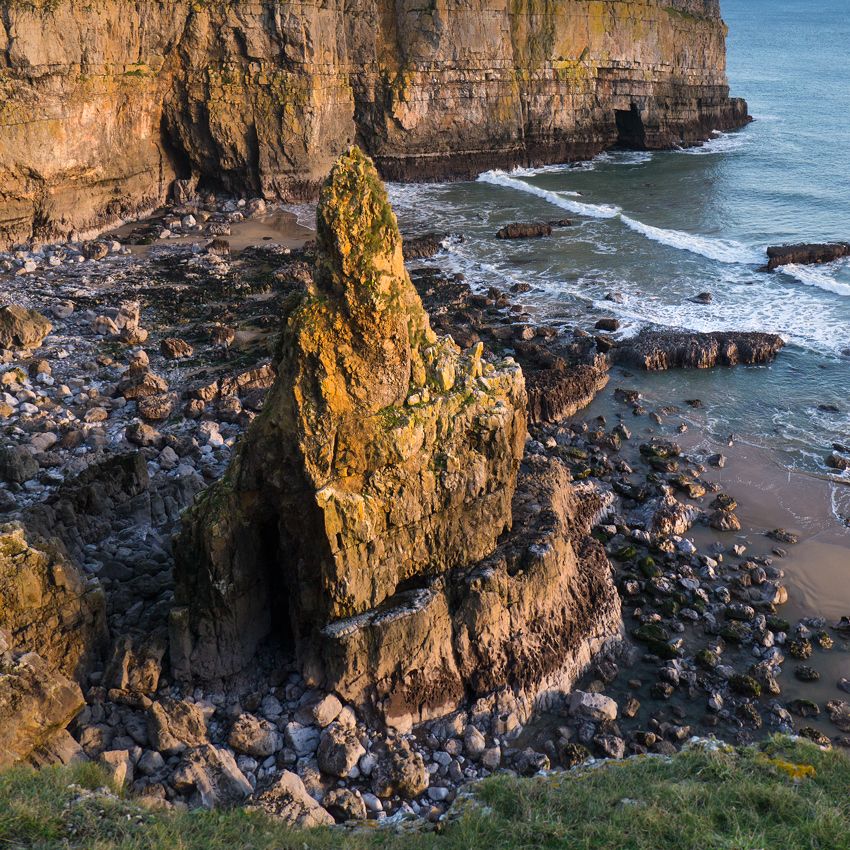
I really like #3 & to remind yourself what a naughty camera it is, you could print that one nice & large & hang it on a wall.... Mine would do, if you have run out of spare space at yours ;D
|
|
|
|
Post by macromeister on Dec 6, 2012 21:19:46 GMT
I really like #3 & to remind yourself what a naughty camera it is, you could print that one nice & large & hang it on a wall.... Mine would do, if you have run out of spare space at yours ;D Yes, I have run out of wall space. Perhaps I should move onto the ceilings - like the Italian masters? ;D |
|
|
|
Post by chrisc on Dec 7, 2012 0:51:51 GMT
Personally, I like the B&W best...
|
|
|
|
Post by Stevewebb on Dec 8, 2012 9:52:58 GMT
I like number 2 the best, but you are right that they are all very postcardy. You should punish the little blighter by taking its battery out and leaving it in a dark drawer for a week.
|
|
|
|
Post by nickjohnson on Dec 10, 2012 14:26:00 GMT
Sorry I'm a bit late to this party – still, I'm used to pop with no fizz in it!
I'm a bit miffed about how your all beating up the wee panny. There is nothing wrong with doing postcards – it's my rice bowl – so lay off. OK?
Oh, and #3 is a gem – well, IMHO it would be If you can see your way clear to doing a square crop of the bottom of the frame. Just make sure that there is no cliff top / horizon showing in the top of the frame. See what I mean?
|
|
|
|
Post by macromeister on Dec 10, 2012 19:05:28 GMT
Oh, and #3 is a gem – well, IMHO it would be If you can see your way clear to doing a square crop of the bottom of the frame. Just make sure that there is no cliff top / horizon showing in the top of the frame. See what I mean? Yeah, I did clock the horizon thing when I took it, but there was no way to avoid it. I was on the edge of an 80ft cliff, so going forwards, while a pleasing option to her outdoors, wasn't really on. Stepping back would have obliterated the view due to the cliff edge. What I really needed was the old photographer's friend (widely used at airshows by those geeky boys with big lenses) a stepladder! But her outdoors was fully loaded on the day.  |
|
|
|
Post by nickjohnson on Dec 11, 2012 18:28:45 GMT
Oh for goodness sake – all I asked for was a deliberate square crop of the image you already have! No need to go chucking yourself at the scenery or getting an innocent bystander to transport decorators equipment so that you can paper over the cracks! What is it around here – what's with all these staff issues?
|
|
|
|
Post by macromeister on Dec 11, 2012 18:57:28 GMT
Oh for goodness sake... What is it around here – what's with all these staff issues? You can't get 'em (staff). My 5DM2 viewscreen hasn't been polished for three months.  But I can see my way clear to a square crop (anything to keep the troops happy)   |
|
|
|
Post by chrisc on Dec 11, 2012 19:14:01 GMT
And there you go, what a much better image!
|
|
|
|
Post by The Wirefox on Dec 11, 2012 20:02:44 GMT
I like close in landscapes and I agree this crop does make a stronger image. It is a very impressive bit of rock but such a difficult subject to do justice to.
|
|