|
|
Post by chrisc on Mar 24, 2013 3:37:03 GMT
|
|
|
|
Post by Stevewebb on Mar 24, 2013 11:35:05 GMT
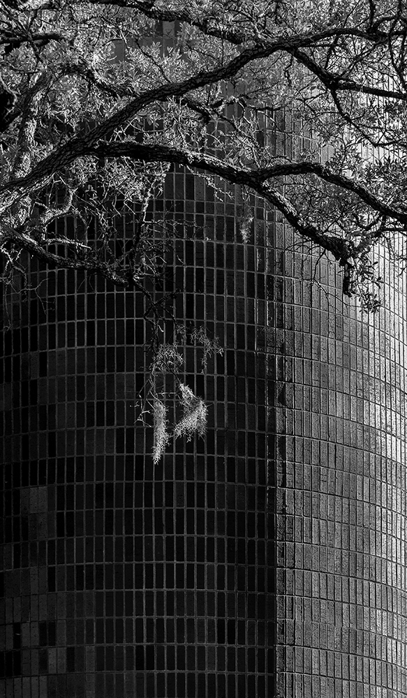
Very nice. It looks particularly good on black.
Although I think I would chop the bottom eighth off as that shadow in the bottom right corner doesn't do much for me.
|
|
|
|
Post by chrisc on Mar 24, 2013 12:30:41 GMT
It was a tossup:  |
|
janis
Working With A Pro
[Mo0:0]
Posts: 898
|
Post by janis on Mar 24, 2013 20:53:41 GMT
Interesting contrasts in tone, texture, line and subject matter, Chris. I think I like the second version better.
|
|