|
|
Post by jiro on Dec 5, 2011 4:31:00 GMT
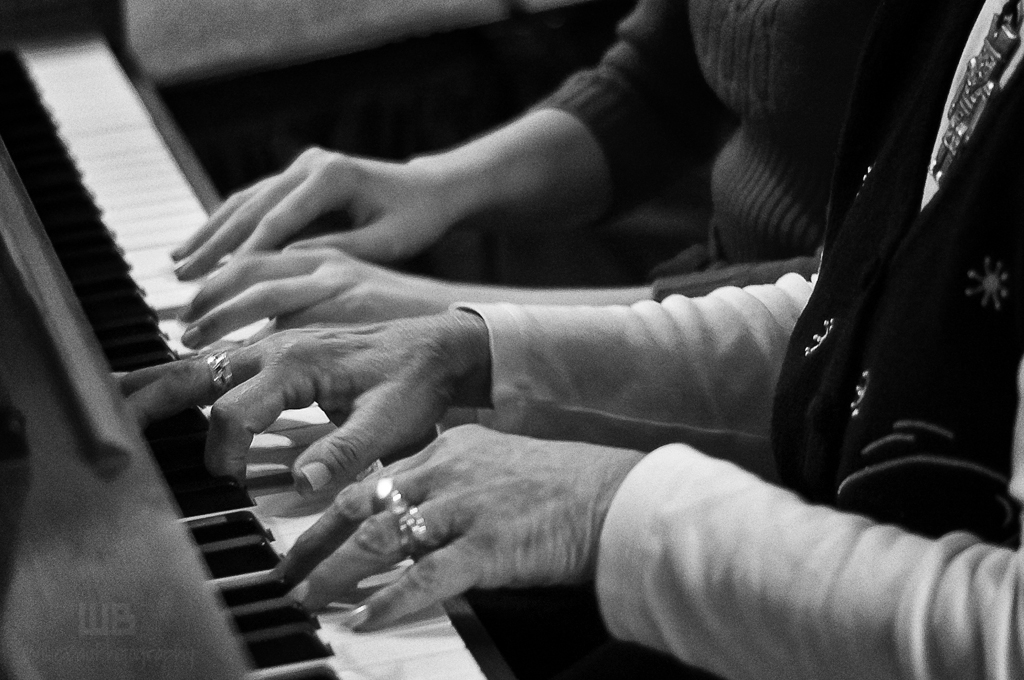
 Nikon D70, 50mm lens, ISO 800, f.2.0 @ 1/50 second. I attended my kids' Junior Music Recital today. While waiting for my kids to perform, I asked the head program coordinator if I can take some photos of the kids performing. She agreed provided I gave her a copy of the shots so the school can have some souvenir of the recital. I happily agreed to her idea. Thank you very much for viewing. |
|
|
|
Post by jeeperman on Dec 5, 2011 5:02:07 GMT
I am sure they will enjoy them for a long time to come Jiro.  I like doing this sort of thing on occasion. I may even print and frame a photo and drop it at someones door. Am I seeing the slight addition of noise here? I like it.  |
|
|
|
Post by chrisc on Dec 5, 2011 14:22:06 GMT
Recrop it to take out most of the keyboard past her right hand, then clone out the microphone that stands out like a sore thumb.
Like the lack of heads as it depersonalizes the scene, but feel there is a lot of wasted, non-productive "scenery" in the shot.
|
|
|
|
Post by jiro on Dec 5, 2011 17:22:06 GMT
From your comment, Chris, this other shot would probably satisfy you.  |
|
|
|
Post by Barry on Dec 5, 2011 17:40:50 GMT
I prefer seeing more of the keyboard, as in your first shot, but I also like the way you have caught the concentration on the faces on the players along with the inclusion of the music sheets in the second shot. You just needed to clone out that music stand leg on right of image.
|
|
|
|
Post by jiro on Dec 5, 2011 17:51:05 GMT
Thanks, Barry. I'll do that on my next edit.
|
|
|
|
Post by chrisc on Dec 5, 2011 18:15:57 GMT
Or, perhaps?  I don't like the second shot at all. Or, perhaps even?   I like this because it shows the juxtapositioning of old hands teaching new, young ones. The faces, background, etc have no bearing on the outcome, so not important. |
|
|
|
Post by jiro on Dec 5, 2011 23:55:44 GMT
This is my cropped edit:  |
|
|
|
Post by katynoelle on Dec 6, 2011 0:43:56 GMT
I like this last edit, Willie! When I saw this before, I wasn't sure what to say - it was such a great idea but not drawing me in. Someone else said it well, perhaps? Too much background? This just zeroes right in on the story. it's much more intimate!  Also, i love the young style of sweater next to the older woman's vest and all of her baubles - so cute and sweet, really. Well, for me, anyway!  |
|